Scroll to top
UI Design UX Design
January 1, 2020

Datasphere

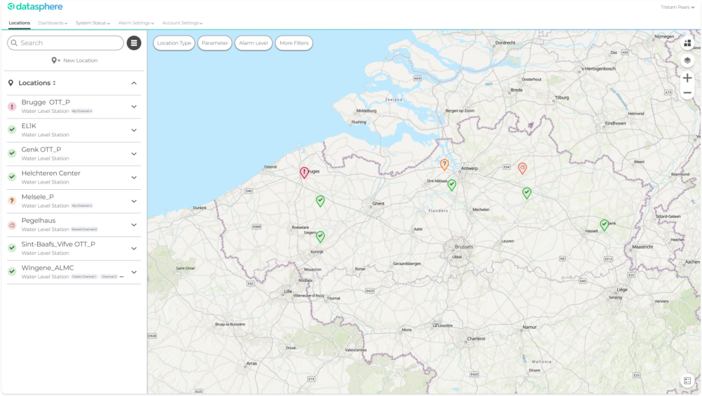
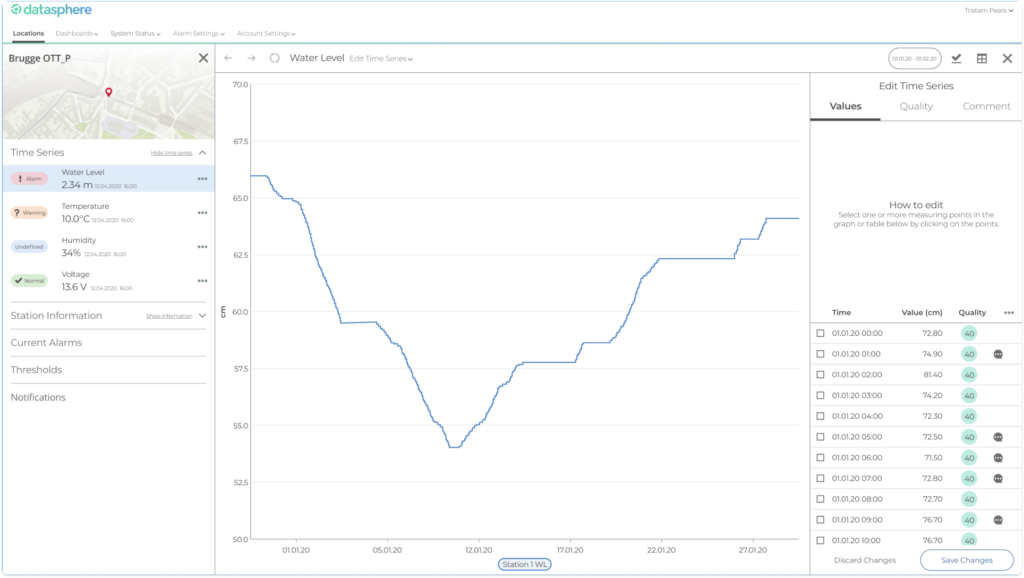
Datasphere is a SaaS product for monitoring and managing environmental sensor networks. It allows both smaller organisations such as local councils, as well as larger agencies to easily set up, manage and monitor sensors for collecting environmental data.
As the design lead, I was responsible for defining the product architecture and workflows, designing the interface, running usability tests, and working with the development team to assure quality. In addition, I was responsible for designing the logo, running branding workshops, and designing the landing page.

Task

Designing a SaaS product for managing environmental sensor networks

  • Strategy

    Design Lead

  • Design

    UX Design, UI Design, User Testing, Design Strategy

  • Client

    KISTERS AG

Datasphere was something new for KISTERS. A new market. A new product. A new brand. I was tasked with designing it.

We began in late 2017 with a technical proof-of-concept and a nebulous collection of ideas and features. Over the course of the next few months, working together with the product owner and developers, I designed a range of workflows and interfaces. Working from written ideas and diagrams through to high fidelity mockups and initial Invision prototypes, we defined a first version of the application. This was used as a basis for development.

One screen from the first MVP version of datasphere.

Testing this concept and actively gathering feedback from a range of stakeholders, users and developers lead us to sharpen the concept and architecture and iterate on a range of ideas that didn’t work. I established the sidebar on the left with content on the right as the main architectural concept. This opened the concept up for a number of new ideas and made it much easier to navigate.

Throughout 2018, I worked as the designer on the development team. Working in 3-week sprints, I made changes to the concept as needed and worked on quality assurance and testing.

The second version of datasphere showing site details in a sidebar on the left and a graph on the right.

In addition to designing the product, I was tasked with working with marketing colleagues to design the datasphere brand as something separate from KISTERS, something more modern. I was heavily involved in developing the name, claim, and text on the website, as well as designing the logo and visual language.

As part of this effort, I redesigned the interface to better fit with the new datasphere brand. I moved it away from the KISTERS blue in the header, changed the font to Montserrat, and updated the colour scheme to be more accessible.

Once the first version of datasphere had been built, I was able to collect user feedback, begin user testing, and iterate on concepts. In addition, I designed a mobile version of the application, focusing on the main network-management workflows and notifications.

Working iteratively, actively collecting feedback, and testing concepts made it possible for us to break with older, limiting design patterns and build a product with the user and their needs as a focus.